
The Psychology of Color in Sign Design
The colors chosen for a business sign dictate how quickly it captures attention, how easily it can be read from a distance, and what emotional response it triggers in potential customers. In sign design, color psychology is not just an aesthetic choice; it is a strategic tool used to maximize visibility, communicate brand values, and drive specific consumer behaviors. For Jacksonville businesses competing for attention on busy commercial corridors, understanding the science of color contrast and emotional association is critical to creating signage that effectively converts passing traffic into paying customers.
Key Takeaways
- Emotional Triggers: Different colors evoke specific psychological responses, such as trust (blue), urgency (red), or growth (green).
- Contrast is King: High color contrast between the text and the background is the single most important factor for sign legibility.
- Brand Alignment: Signage colors must align perfectly with the company’s established brand identity to maintain consistency.
- Environmental Context: A sign’s colors must be chosen based on the surrounding environment to ensure it stands out rather than blending in
Table of Contents
- How Color Influences Consumer Behavior
- The Science of Color Contrast and Legibility
- Industry-Specific Color Strategies
- Accounting for the Surrounding Environment
- Frequently Asked Questions About Sign Colors
How Color Influences Consumer Behavior
Color is the first element of a sign that the human brain processes, registering even before the shape of the sign or the text itself.
Color Psychology: The study of how different colors affect human mood, perception, and decision-making processes, particularly in marketing and branding.
Research shows that up to 90% of snap judgments made about products can be based on color alone [1]. Therefore, selecting the right color palette for your exterior and interior signage is essential for setting the right tone.
- Red: Creates a sense of urgency, excitement, and passion. It is highly visible and often used for clearance sales, restaurants, and impulse-buy retail.
- Blue: Evokes feelings of trust, security, and professionalism. It is the dominant color for financial institutions, healthcare facilities, and corporate offices.
- Green: Associated with health, nature, wealth, and growth. Commonly used by outdoor brands, organic food stores, and financial services.
- Yellow: Represents optimism, youth, and clarity. It is highly effective for grabbing attention, especially when used in high-contrast combinations.
The Science of Color Contrast and Legibility
While emotional association is important, the primary function of a commercial sign is to be read. This is where color contrast becomes the most critical design factor.
If the contrast between the text color and the background color is too low, the sign will become an illegible blur to passing drivers. The Outdoor Advertising Association of America (OAAA) has conducted extensive research on color combinations that yield the highest legibility from a distance [2].
| Top High-Contrast Color Combinations | Poor Low-Contrast Color Combinations |
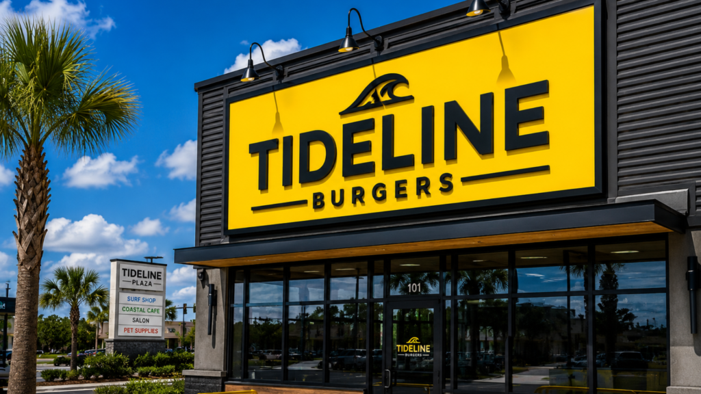
| Black text on Yellow background | Red text on Green background |
| Black text on White background | Blue text on Black background |
| Yellow text on Black background | Yellow text on White background |
| White text on Blue background | Green text on Red background |
When designing a monument sign or channel letters, sign fabricators must ensure that the brand’s colors provide enough contrast to be readable both during the day and when illuminated at night.
Industry-Specific Color Strategies
Different industries lean heavily on specific color palettes to quickly communicate their services to consumers.
- Healthcare: Hospitals and clinics rely on blues, greens, and crisp whites to convey cleanliness, healing, and calm. Red is used strictly for emergency room directional signage.
- Food and Beverage: Fast-food restaurants heavily utilize reds and yellows, which are known to stimulate appetite and encourage quick turnover. Fine dining establishments lean toward black, gold, and deep reds for a premium feel.
- Commercial Real Estate: Property management signs often use navy blue, forest green, or black with white or gold lettering to project stability, luxury, and authority.
Accounting for the Surrounding Environment
A beautifully designed sign can fail completely if the designer does not account for the physical environment where it will be installed.
For example, a dark green monument sign might look excellent on a computer screen, but if it is installed in front of a dense line of oak trees, it will become practically invisible to passing traffic. Similarly, a bright blue sign might get lost against the backdrop of a clear Florida sky if mounted high on a building. At Duval Sign Solutions, we conduct site surveys to ensure that your sign’s colors will “pop” against the surrounding architecture, landscaping, and competing signage.
Frequently Asked Questions About Sign Colors
Do illuminated signs change color at night?
Yes, illumination can alter how a color is perceived. For example, a dark blue acrylic face might look black when not lit, or a white face might look slightly yellow depending on the color temperature (Kelvins) of the LED modules used. Professional sign designers account for this shift during the fabrication process.
What is the most visible color for an exterior sign?
Yellow is generally considered the most visible color to the human eye, which is why it is used for traffic warnings and school buses. When paired with black text, it provides the highest level of contrast and legibility from a distance.
Can I use my exact brand colors for my sign?
Yes. Professional sign companies use Pantone Matching System (PMS) codes to accurately match your brand colors when painting metal, printing vinyl graphics, or selecting colored acrylics, ensuring complete brand consistency.
Partnering with Duval Sign Solutions
Choosing the right colors for your business signage requires balancing your brand identity with the scientific principles of contrast and visibility. At Duval Sign Solutions, our design team understands how to leverage color psychology to create signs that capture attention, communicate your message, and drive traffic to your Jacksonville business.
Ready to design a sign that truly stands out? Request A Consultation today to speak with our experts.
References
[1] Singh, S. (2006). *Impact of color on marketing*. Management Decision, 44(6), 783-789.
[2] Outdoor Advertising Association of America (OAAA). (n.d.). *Design Guidelines for Out of Home*. Retrieved from https://oaaa.org/